Portrait 2/52 - Tracie
 January 19, 2014 |
  ∞
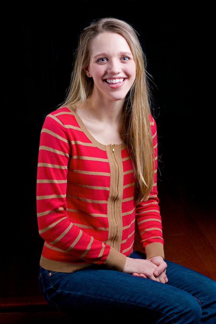
∞ For my second official portrait of the year, my sister-in-law Tracie agreed to be my subject. I decided to go for a black background look and got this:

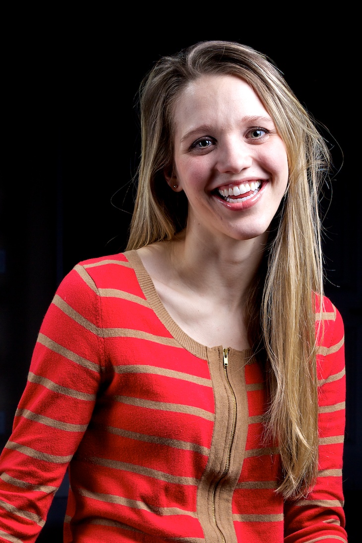
Partway through the shoot, my daughter wandered over and sat on the step down from Tracie. It was a fun moment and turned into one of the more organic expressions from the shot. I like the honesty of expression even if Tracie’s hair is starting to get a bit unruly:

Technical Details
My lighting setup was somewhat similar to my previous shoot with some notable changes. My main light was a 24” square softbox at camera right with the flash set to 1/2 power. I again used my 8x36 gridded stip box at 1/4 power as a rim/fill light about even with Tracie camera left. I had a third bare flash as a hair light set to low power (I think around 1/16) coming from behind and above Tracie at camera left. I started with a shoot through umbrella as the main light but it was throwing too much light into the room behind Tracie so I swapped it out for the soft box. The camera was set to 1/160s, f8.0, and ISO 100.
Conclusions
After this session I am again impressed that I need to work on several things while shooting. First, I need to develop more confidence both in what I’m doing and with the vision for the shoot. Second, I need to develop a better rapport to help direct the subject into good positions and expressions while keeping them at ease. I think I need to be looser and more confident and that will help subjects remain loose and comfortable.
Also, I don’t like this set up as much as my previous one for several reasons. First, both lights were coming at a steep angle relative to the skin. While the shadows weren’t too deep, the lighting brough out a lot of texture in the skin. Luckily Tracie has nice skin so it wasn’t a problem but this setup could do some damage with subjects that aren’t quite as youthful. This effect was probably increased as I neglected to use the reflector for fill this time around. Second, there was enough spill on the background that it really added work for me during post to get the background to go to black. Finally, aesthetically I wasn’t thrilled with the overall feeling of the shots and I think that the lighting had a lot to do with that. Of course, that’s one of the main reasons I’m doing this project is to learn what works and what doesn’t.

Reader Comments