
To Craft an Invitation
 ∞
∞ A few months ago, Jamie’s grandmother asked me to put together some ideas for a postcard invitation to El Dorado Adventist School’s annual Alumni Weekend. This school has meant a lot to us — Jamie and I both spent almost all of our pre-college days attending EAS. And then, just this week, our nephew became the fourth generation to attend EAS as he started Kindergarten.
So, when I was asked to design the postcard invitation I immediately said yes. And then I started thinking of where I wanted to go with the design. I figured I should start with some research.
I did some image searches for various school reunion/alumni weekend invitations and came away generally unimpressed. Then I did some searches for more generic event invitations and found some inspiration in the tech sector. Based on my research, I determined that I wanted something bold, eye-catching, and memorable for the front — something that would catch your eye that was simple and uncluttered.
So I started thinking about what would make a good core for an idea — a good hook. I spent a lot of time thinking until one night, as I was supposed to be falling asleep, I had an idea.
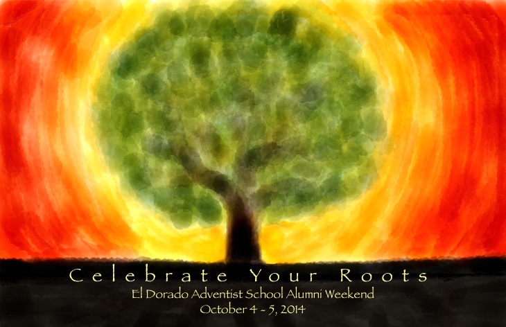
Roots. Like “Return to Your Roots”. With an eye-catching image of a tree.
As I thought more about this, I began to get excited. This was it! It related to the idea of returning to a very formative period of one’s life. And it related to the region — there is a strong heritage of agriculture in our small foothill community, especially the regionally known Apple Hill.
So I grabbed my iPad and very roughly finger painted my basic idea using the Paper app. And then I went to sleep.
In the morning, I showed Jamie my rough sketch and she suggested I go with “Celebrate” instead of “Return to”. I decided that put a more positive spin and sounded more like a party so I went with it.
Now that I had my idea, all that was left was all of the final graphics work. I went back to Paper and worked out a much more refined version of the tree graphic. Then I pulled that into Pixelmator, did some adjustments, and added the text in a font that fit well with the organic theme of the invitation. And I had my front:
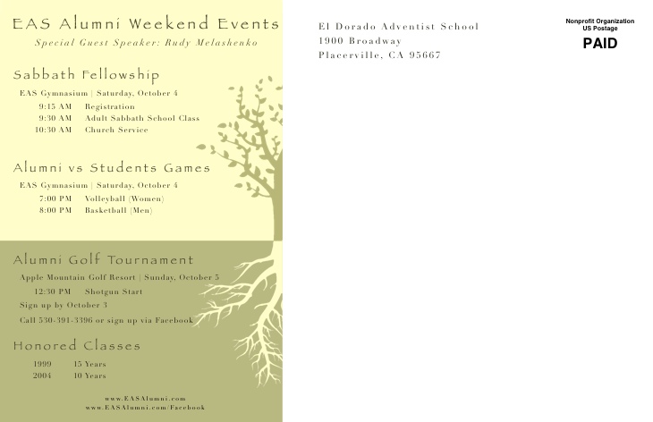
Now all that was left was the back. Most of the back is prescribed by the postal service, so I only had about a third of the postcard to design. There was a lot of information to convey — the weekend schedule, honored classes, guest speaker, websites, and more. In addition, I wanted it to relate to the theme established on the front side.
I decided that with the increased density of information I would try and keep the graphic design simpler and more subtle. I tried a few different ideas and settled on a tone on tone design with a two part tree graphic — branches and roots to relate to the overall theme. I eye-droppered a light yellow/green from the front design and used that as the basis for the backside colors. After some tweaking, I had the back:
I’m pretty pleased with how it turned out. Let me know what you think in the comments.
And if you went to EAS, definitely come out to this year’s Alumni Weekend. I’ll be there.
Reader Comments (1)
I like your design very much.