National Geographic's Best of 2012
National Geographic has published the 2012 National Geographic Photo Contest Winners. As per National Geographic’s reputation, the photos are of course exquisite.
Photo by Ashley Vincent
National Geographic has published the 2012 National Geographic Photo Contest Winners. As per National Geographic’s reputation, the photos are of course exquisite.
Photo by Ashley Vincent
No place is perfect. Many are far from perfect. Regardless of the quality, every place has elements that can prove instructive in how we can improve the way we make places. This is, hopefully, the first of what will become a regular series about taking lessons from the places of our lives and finding ways to make better places.
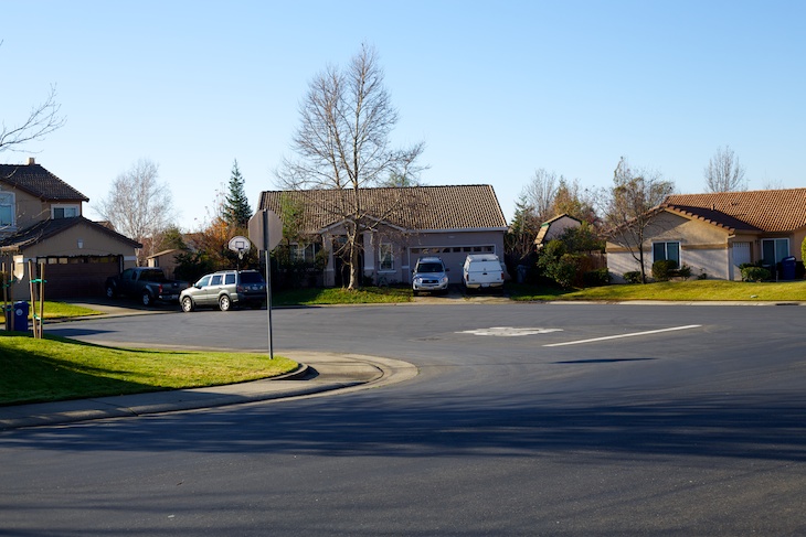
In this post, I’m looking at a strange half cul-de-sac condition located in Folsom, California:
There are a lot of things that could be done better in this neighborhood: the street network has some issues, the streets are quite wide, the houses could address the street in a more urban way, etc. But for now, I would like to focus just on the strange half cul-de-sac and look at some simple strategies to make it better.
First, what is wrong with this design? My primary concern is that the cul-de-sac consists of a very large expanse of asphalt.[1] This has a negative impact on the human experience of the street, adds expense to the initial cost and maintenance cost of the street, and takes up valuable land without any appreciable benefit. The cul-de-sac is not needed as a fire truck turn around as the distance off the street is far less than the maximum distance allowed without a turn around. The additional width isn’t necessary for normal vehicular access to the few houses that front the space either. So we have a large expanse of costly, ugly asphalt with no benefit. If we were designing this more thoughtfully, what could we do with that space?
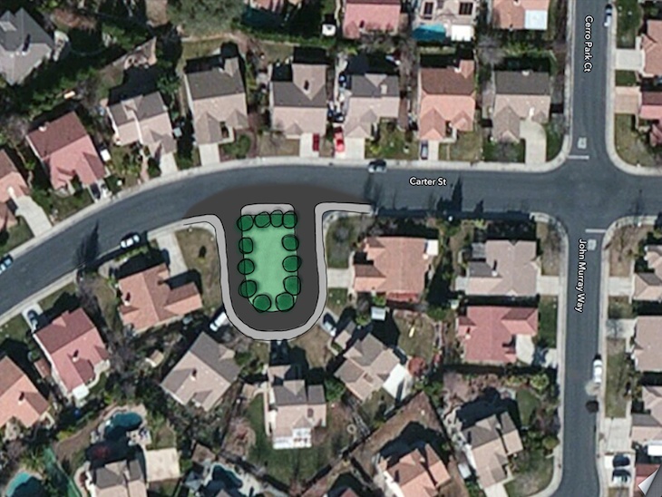
There are many ways this space could be improved but I will focus on just one - the simplest adjustment. I would start by establishing a narrow street around the perimeter of the existing cul-de-sac. This could be quite narrow as it only serves a few houses, ample street parking exists on the main street, and traffic could flow one way. The fire department probably has a minimum clear width required for access, so we could use that as a starting point. In this location, the fire department would probably be interested in having 20’–0” clear but I would advocate for something less, perhaps 16’–0”. At 20’–0“, we could continue having two way traffic. At 16’–0”, we will need to restrict traffic to one way[2] and we will still have some street width left over. Traffic should be slow and infrequent, so we can combine the sidewalk and vehicular way into one multi-use lane. To keep the feeling of a narrow lane, we will not provide street parking. There is plenty of street parking on the extra wide street, so these few houses shouldn’t suffer from having no place for their guests to park. Finally, to help designate this lane as something different from the typical car dominated street, we will use an alternative paving material.
So we have a narrow shared use lane running around the perimeter of the existing half cul-de-sac. What do we do with the remainder in the middle? The answer is anything we want. We now have this nice little area to provide any amenity we want. It could be as simple as some landscaping, it could be a mini park with some play equipment, or it could be more elaborate. The point is - it isn’t asphalt. It becomes a usable, lovable place that provides an amenity to the neighborhood.
If we just stop there, we have taken relatively simple measures to improve the quality of the place. We end up with a close - a three sided urban space attached to a street. We have transformed a moonscape of asphalt into a neighborhood amenity and we haven’t really changed much at all.
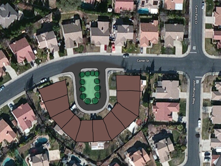
Of course, this now brings up a lot of additional possibilities. Now that we have made something of this space, we can look at changing the properties around the close to better complete the design. We could introduce an alley to push the garages into the back. We could half the lot size and double the number of houses on the close (a great, low-impact way to introduce a different housing type into a pretty monotonous neighborhood). We could then push the houses together and create a well defined close with 2–3 story attached townhouses along the three sides. The point is, with a little creativity and considered design, we can take a dull, lifeless left-over space and create something special. We can make places better.
While it is of seemingly little consequence, the stop sign from the cul-de-sac to the street demonstrates the ridiculous design of this space. Also the distance between the sign/curb and the actual painted “STOP” with the line continues the absurdity. ↩
The traffic will be infrequent and slow, so there is no need to overly enforce this one way designation. This lane could be treated as a shared loop driveway for the houses and as such wouldn’t need to have the direction designated in any way. ↩
Christine Sarkis, writing for Yahoo Travel, has some suggestions for where to explore in 2012:
Here’s a great New Year’s resolution: Travel more. We’ve looked into the 2013 crystal ball and found destinations to dazzle in the year ahead. Find out why you’re invited to the Emerald Isle, how the City by the Bay is making the most of its waterfront, and which country is set to make a dramatic solo debut into the European Union next year.
These 10 picks will inspire your travel adventures and finally give you a New Year’s resolution you can stick to.
I think it’s a great list - there isn’t one place that I wouldn’t want to explore. Without exception, the places on this list are either great urban centers of culture and human life or areas of great natural beauty and interest. These are places that celebrate the spirit and vitality of humanity or places that remind us of our place in nature. These are places that reflect a little slice of heaven on earth whether that heaven is pristine nature or the bustling communal life of the city.
When IBM asked kids for ideas to make the world a better place, ten year old Aurora suggested making crosswalks that glow when occupied by people. This makes the crosswalks more visible to drivers and emphasizes the fact that someone is indeed trying to cross the street - potentially making the crossing safer. IBM made it happen:
In general, I am typically skeptical about purely technological solutions to city problems but I think this is great. Just look at the smiles on the faces of those who cross. This sidewalk is providing interest, delight even, to the people on the street. That is what great urbanism is all about - providing delightful, interesting places for people. If this delightful crosswalk makes for improved safety as well, then its a win all around.
Via Grist
Speaking of transit, Mike Rosenberg reports for the Ovoville Mercury-Register regarding the Valley Transportation Authority’s poor success record with its light rail system:
But there was no grand celebration this month as Silicon Valley marked 25 years of light rail.
The near-empty trolleys that often shuttle by at barely faster than jogging speeds serve as a constant reminder that the car is still king in Silicon Valley – and that the Valley Transportation Authority’s trains are among the least successful in the nation by any metric. Today, fewer than 1 percent of the county’s residents ride the trains daily, while it costs the rest of the region – taxpayers at large – about $10 to subsidize every rider’s round trip.
As Jeff Speck tweets:
More evidence that transit without neighborhoods is like trains without wheels
Transit only works well when connecting two walkable places - two neighborhoods. A transit system designed to be a parallel transportation system to an auto-centric region is sadly doomed to irrelevance at best and failure at worst.
Ted Mann, writing for the Wall Street Journal, reports on the new New York Subway app:
America’s largest subway system launched a smartphone application that will reveal train-arrival times on seven of the city’s 24 lines—a leap forward for a service that has lagged behind its peers both at home and abroad in adopting new technologies.
[…]
The app breakthrough, long awaited by many of the city’s straphangers, will allow at least some riders to plan their commute by the minute for the first time in the system’s 108-year history.
Good move but the subway system apparently is showing its age based on the cost and timing of this app. The system only works on lines that have had expensive upgrades to the signal systems which enables centralized computers to collect the data on every train. Regardless of how they got here, this is the future of transit - user friendly, service oriented mobility.
In what some have called a shocking development, a new report from New York City calls into question the “greenness” of the venerable glass tower. As Mireya Navarro reports for the New York Times:
In courting tenants over the last six years, 7 World Trade Center has trumpeted its gold LEED rating, an emblem of sound environmental citizenship.
But when it comes to energy efficiency, the young 52-story tower is far from a top performer, according to data released under a city law that tracks energy use in New York buildings. It had a score of 74 — just below the minimum of 75 set for high-efficiency buildings by the federal Environmental Protection Agency’s Energy Star program.
On the other hand, two venerated show horses from the 1930s, the Chrysler Building and the Empire State Building, sailed to an 84 and an 80 as a result of extensive upgrades of their insulation and mechanical systems.
And the MetLife Building, a 1963 hulk looming over Grand Central Terminal? It scored 39. Still, solace is at hand for MetLife’s owners: the Seagram Building, Mies van der Rohe’s bronze-toned 1958 masterpiece on Park Avenue, posted a 3.
So cladding an entire building with the least energy efficient building system in common use makes for energy hogs? Shocking! Even with all of the advances in glazing technology (double glazing, triple glazing, various high performance coatings, thermally broken frame systems, even ventilated double walls), renovated 80+ year old buildings can outperform new LEED Gold glass towers. There seems to be a pervasive myth that glass towers are somehow green. While it is true that a glass tower can beat some energy benchmark and collect some LEED points in the process, it is also true that glass remains one of the least energy efficient cladding systems and glass towers that achieve LEED certification could be much more energy efficient if designed with a different cladding system.
Simon Usborne, writing for The Independent, relays the benefits of cycling:
Several studies have shown that exercises including cycling make us smarter. Danish scientists who set out to measure the benefits of breakfast and lunch among children found diet helped but that the way pupils travelled to school was far more significant. Those who cycled or walked performed better in tests than those who had travelled by car or public transport, the scientists reported last month. Another study by the University of California in Los Angeles showed that old people who were most active had 5 per cent more grey matter than those who were least active, reducing their risk of developing Alzheimer’s.
[…]
Cycling has even been shown to change the structure of the brain. In 2003, Dr Jay Alberts, a neuroscientist at the Cleveland Clinic Lerner Research Institute in Ohio, rode a tandem bicycle across the state with a friend who has Parkinson’s to raise awareness of the disease. To the surprise of both riders, the patient showed significant improvements.
It is undeniable that regular exercise has far reaching benefits to individuals and society in general. It always amazes me how far these benefits extend. To be the most effective, activity needs to be integrated into the daily routine of our lives and not a separate activity that needs to be accommodated and scheduled (or ignored). Making places where exercise can occur organically should be one of our highest priorities. That means making places that are walkable and bikable - places where the car exists in harmony with other modes of movement rather than reigning supreme.
Via Planetizen
Irina Vinnitskaya, writing for Arch Daily, on the shifting American Dream:
A recent survey into the billing activity of architecture firms across the country has revealed a growing trend in homeowners’ preferences. The AIA Home Trends Survey released a series of charts, marking the rise between 2011 and 2012 of preferences for low maintenance, and energy efficiency home options with a rise in a desire for homes that have a proximity to neighborhood amenities. What this means is that home buyers are moving away from the auto-centric lifestyle of mid century suburbs and are coincidentally opting for the more sustainable choice where walking and public transportation may take preference. AIA Chief Economist, Kermit Baker, PhD, Hon. AIA, notes that in many areas, there has been a rise in interest in urban infill locations over exurbs, and a general push within communities for public accessibility and proximity to work places, retail options and open space.
This is just more evidence of a growing trend - walkability is on the rise, auto only is waning.
Brent Toderian on the advantage of walkable cities in inclement weather:
In the broader sense, big snowfalls can illustrate how especially vulnerable car-dependent cities and suburbs are to disruptive weather patterns. Is everything you need widely separated — home, job, shopping, your kids’ activities — with driving the only option? If so, snowstorms can really make life difficult or even miserable.
Compact, “complete,” walkable, transit-friendly cities on the other hand might feel the effects of snowstorms, with disruptions to transit especially where it shares the roads with cars, but they tend to be more resilient, with things closer together and more options on how to get around.
There is a beautiful, muffled calm to a city in the snow. I was in Washington D.C. for a major snowstorm in January, 2000. We had no issues with mobility. In fact, getting around may have been easier due to the city essentially shutting down. Our problem turned out to be that almost everything we wanted to do was closed. It is a strange and unique feeling being almost the only ones in the rotunda and walking the quiet, deserted streets had an almost otherworldly quality.
The Studio Stoop is a participant in the Amazon Services LLC Associates Program, an affiliate advertising program designed to provide a means for sites to earn advertising fees by advertising and linking to Amazon.com.